|
Craig Steiner, u.s. Common Sense American Conservatism |


|
|
About Me & This Website My Positions On Facebook Contact Me Articles |
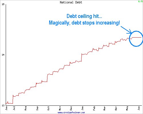
Once per day the U.S. Treasury Bureau of the Public Debt publishes the latest figure for the national debt on their website.  For years, my website has been automatically downloading that information, republishing the total debt on the left sidebar, and also publishing a graph of the national debt for the preceding year. Lately, I've been wondering if the software I wrote to do that had somehow stopped working because the national debt hadn't changed for quite some time. I checked my software and you know what I found?  Isn't that a sight to behold? After years of seeing the debt chart on my website constantly moving higher, seeing it turn into a straight line is absolutely beautiful! Of course, it won't last. Eventually they'll raise the debt ceiling and all the accounting tricks they've been playing to shuffle money around will be unwound and almost immediately applied to the national debt. So when the debt ceiling is raised, the debt will go up. But this is exactly the kind of graph we want to see in the national debt and it's nice to see it... if only for awhile. Go to the article list |